Color Theory, A Paint Palette, Along With
Creative Chaos
September 1, 2026
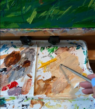
Colors, and more colors I drop onto my painting palette when I’m working on a painting. When I start a painting everything begins as, simple and kind of orderly, for a painting. Probably three to four colors when first beginning a painting for the base coat. While I work, I start mixing more colors to create variations of lighter or darker hues.
As a painting progresses from the base colors, to more definition of colors, and before you know it, usually within a couple days, my palette looks like a complete mess! But its a mess to anyone who would look at it and think, “how are you going to paint a picture with colors all over the place.” I like to think of it as my organized mess.
When going to art school at The School of Visual Arts in New York a long, long time ago…the early eighties, to be exact. My freshman year you learned about color theory, warm colors, cool colors, how to mix colors to get entirely new ones. A basic example would be mixing a blue with a red and you get purple, but there are many variations of blue and red so when you mix with different hues of warm or cool, the kind of purple you will get can vary quite widely.
The storage box of colors that I keep are not a lot because I learned early from school color theory class, you can keep the basics. I’ve met artists who buy every color that’s out there because they don’t mix too often. Maybe red with white to get a lighter reddish pink. I’ve always preferred mixing my own colors. It gives me an endless range of subtle variations and helps make each painting unique.
Currently I am working on a pet portrait for a client and this painting I am having a bit of a hard time working out the colors, its challenging me more than I was expecting. It has more to do with the reference photo I was given but also for some reason I feel like I’m not capturing the true variations of tan this dog has. What looks tan at first glance is actually a collection of warm golds, browns, some soft grays and cream, even hints of lavender in the shading.
My palette becomes a roadmap in creating this painting. What looks like messy chaos is in reality hours of observation and experimentation. Its not about memorizing a color wheel its about learning to truly see. Nature rarely shows you a single, solid color. Every leaf, feather or fur you look at is made up of so many subtle, warm or bold colors. Its about training your eye to see those subtle colors and textures. When I look at a reference photo I see so many nuances in just one small part of let say a dogs face. Shading with subtle grays and then going into tan with flecks of dark highlights on its fur. It can really immerse you into the painting and getting the colors right.
So as I work, I will happily embrace my messy palette because it isn’t really a clutter mess of colors, its really showing that I’m exploring, observing and learning how to bring each painting to life.
📩 Reach out through my contact information for all sale inquiries.